Being an indie author — if you want to do it right — is not cheap. For one thing, your work will need editing, formatting, and a cover. And don’t forget to consider a marketing budget, too! For a complete breakdown of potential costs, I highly recommend Lit Chic’s post, “You’ve Got to Spend Money to Make Money.” She goes into the nitty-gritty details using her own indie experience. And she also stresses budgets and realistic expectations for return on investment.
I’m not rich. Usually, when I start to do financially well (just well, never even approaching wealthy), I either lose an organ (down two so far!), my car acts up, or my house requires repairs. It’s like clockwork. While self-publishing Acceptance, I was suffering gallbladder attacks, which led to the organ’s eventual removal and a pile of medical bills. Now as I’m self-publishing Long Way Down, that medical bill pile is still there, so both releases have had a shoestring budget at best. Since both are short stories, I had to have very small expectations for my ROI.
Covers, on average, can cost in the hundreds. No short story (at least not by an unestablished writer) is ever going to earn that expense back. Thankfully, I have a bit of artistic capability and opted to design and create my own e-book covers.
DIGITAL PAINTING
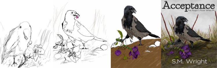
For Acceptance, I opted to digitally paint the cover, which would feature Svein’s pet crow, Vidar. I knew I enjoyed painting in Photoshop (I actually find it relaxing), and that I could decently draw most animals, including birds. I started with several concept sketches on physical paper and also looked at a variety of hooded crow photos. After the groundwork was laid, I completed the line art in Photoshop and then started painting. The process spanned several months since I failed to set a strict work schedule on the project. Working with numerous layers, I eventually had the entire project done and was able to add in the text after trying a variety of font combinations.
Pros: I was able to cut a huge expense from the project; in fact, the only thing lost was time. For the most part, the cover did come out looking professional, though I figure someone more talented could have done better. I also rather enjoyed the painting process, minus some major frustrations.

Cons: It ate up a lot of time that could have been spent writing or editing. There were major frustrations where I was pulling out my hair. You would not expect grass to be challenging to paint, but it was!
Summarized Thoughts: All the other covers in The Augur’s Rose Series will be digitally painted by me. I have many mockups sketched for subsequent entries in the series, but I hope to set up an actual schedule for future covers to streamline the process.
Minimalistic Cover
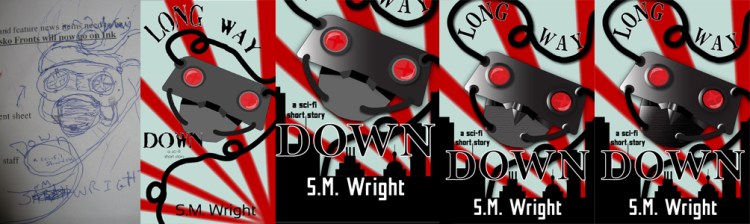
I really enjoy minimalistic book covers. There is just something pleasing about them to me. And after struggling to decide what to use for Long Way Down, I finally decided to pursue a minimalistic cover. I also set my mind on completing the cover in Adobe Illustrator. The catch is I have very little experience working with this program. My co-worker Mary, a graphic designer, was willing to give me a tutorial in Illustrator, and I went from there. Much like Acceptance‘s cover, I started with pencil sketches before translating them into the design program. Using shapes and paint brushes, I gradually worked the cover until it resembled the sketches. It still did not look very good, but when it struck me to include a city-scape along the bottom, the cover came together. I also met my one-true-love: the gradient tool. This handy-dandy tool really helped add depth and interest to the cover.
Pros: It was a good crash course in Illustrator, and I learned a lot. Overall, it also took a lot less time to complete, especially when compared to the digital painting process.
Cons: Since I’m unfamiliar with Illustrator, I feel like there are tools and tricks that I missed out on when creating this cover.
Summarized Thoughts: I will probably use Illustrator again to create more minimalistic covers. I actually have one in mind for a potential November release.
Future Indie Covers
I plan to create my own covers for future short stories. I need to get some ROI on them, and that will not happen if I outsource their covers. If I self-publish my sci-fi novel, however, I plan to hire a designer for its cover. With a novel, there is a greater chance of making that money back. Another major deciding factor is the fact –that beyond a project in one of my professional writing courses — I have never designed a wraparound book cover, which includes the front cover, the spine, and back cover.
Still, it is possible to cut down on costs as an indie author, especially if you are just starting out. However, if you do proceed with your own covers, always seek out feedback and look at other covers in the market. Also, research common cover mistakes.
Long Way Down: A Sci-fi Short Story is currently available for pre-order on Amazon, https://goo.gl/BSWDZN. It will automatically deliver to your Kindle or free Kindle app on Saturday, July 7.
A war orphan and survivor of genocide, twelve-year-old Yuu has learned what it takes to survive over the course of twenty raids. When her latest sanctuary comes under assault, she ignores her better instincts and rescues two siblings. However, as the city topples around them, Yuu wars with herself: abandon the younger children and increase her own chance of survival or go together to whatever end. She knows all too well what hunts them . . . and she refuses to face the monsters with red eyes again.

